Hawkeye (2012-2015) | Artistic style and storytelling
Year
Format
Clint Barton, aka Hawkeye, became the greatest marksman known to man. Then he joined the Avengers. This is what he does when he’s not an Avenger.
Hawkeye (2012-2015) is a Marvel Comic series, and every single issue begins with that sentence. Clint Barton is an ordinary man who finds himself protecting the Earth along with super-soldiers, gods, and billionaire playboy philanthropists. Insisting on this element, Matt Fraction (Sex Criminals) decides to describe his daily life.
The character is often depicted with plasters, band-aids, and other signs of injury, reminding the readers that he is, after all, just a human being. The narrative of this comic series depends on the visuals. The artistic style of the illustrator, David Aja, contributed to giving a unique kind of depth and impact to the storytelling of Hawkeye, pushing the limits of comics as a medium.
An ordinary man in an ordinary road
The plot puts aside things like alien invasions or supervillains and becomes rougher, rather more intimate. It’s funny, too, in a bittersweet way, like Bojack Horseman.
A Brooklyn apartment building where Clint has decided to live becomes the epicenter of the story. A gang of Russian mobsters, as grotesque and hilarious as dangerous, has decided to evict all the tenants in order to demolish the building. Hawkeye, accompanied by his faithful dog Pizza-Dog, who loves pizza, and the young Kate Bishop, called Hawkeye too, will become the guardian of that place.
Hawkeye by Fraction and Aja is the story of a man trying to be better. A man with all of his flaws, with difficult relationships, trying to make it. It’s a small story but one that represents everyday life. Where it’s not a question of the whole world being in danger, but just that neighborhood, with a limited number of people to be saved.
An artistic style as storytelling
Matt Fraction pushes the reader to undertake a proactive and busy role. The issues follow a non-chronological narrative, full of flash-forwards and flash-backs, like a Tarantino movie. The story begins in media res, with the hero in the middle of the action and the danger. Entire chapters are narrated and then re-narrated from different points of view.
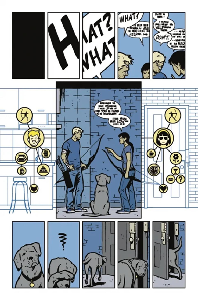
One example is the award-winning issue 11th, an entire chapter narrated entirely from Pizza-Dog’s point of view. The words become unreadable, and, in their place, a series of icons and visual solutions appear, like a Chris Ware (Building Stories) book.
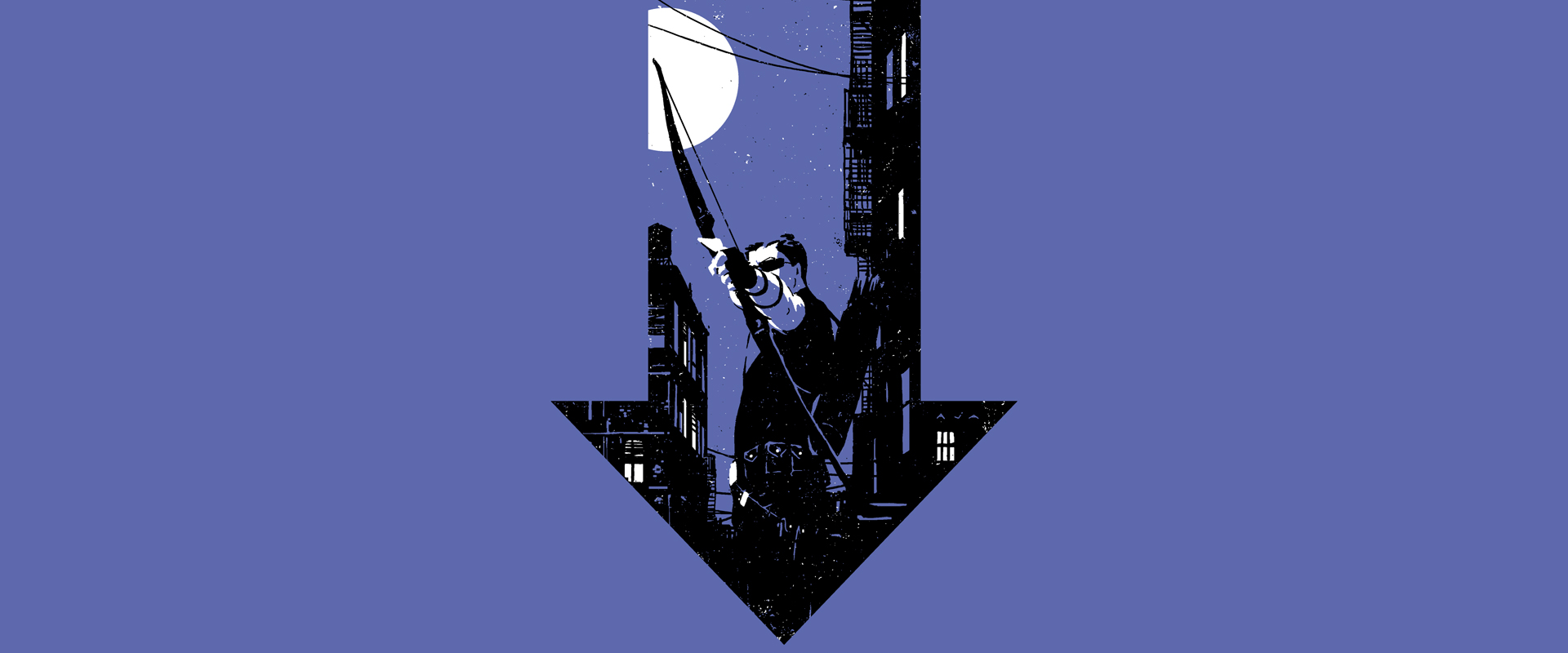
In that issue, more than in any other, the contribution of illustrator David Aja stands out. Aja’s drawings are more than a medium to tell Fraction’s story. The graphic style that is so authorial becomes a narrative tool in itself. Dirty, minimalist, using a restricted color palette in which purple is omnipresent.
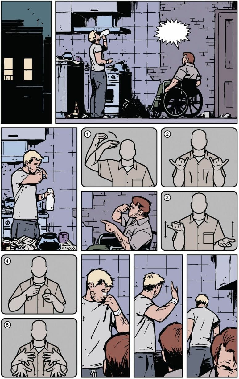
Another highlight of the series is issue 19th. Following a confrontation, Clint becomes temporarily deaf. Aja shows the balloons anyway, but they are blank, so that the reader can feel the silence of something said but not heard. The scenes are combined with images that translate the dialogue into sign language, becoming part of the narrative.
These experiments show to what extent can comics be bent and modified. And that it is an unlimited source of innovative and original ideas.
The series is among those Marvel Comics which has won numerous awards, including Eisner Awards for Best Cover and Best Designer in 2013, and Best Single Issue and Best Cover in 2014. The Marvel Cinematic Universe includes a live-action series inspired by this run, released on Disney+.
Tag

